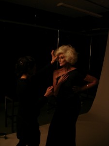
 To prove the point regarding angles (#24), here’s a photo I took of Carmen dell’Orefice at a photoshoot a few years ago.
Carmen working it at 78 (years at the time).
BDW
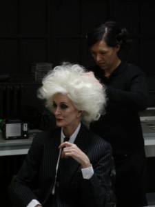 A few years ago I had the pleasure to assist on a photoshoot where the model was the wonderful Carmen dell’Orefice. Turning 80 this year, she is one of the grand dames of the fashion industry, but she wears the mantle lightly.
No airs or graces, no quirky demands (just an Americano coffee), just pure professionalism. She would put on the outfit, and with a slick of lippy and a tousle of the glorious white hair, away she went. Working the clothes, getting the angle just so, looking down at her body almost as if disembodied, to see she was in the right frame to capture the best of the frock.
It was almost a disappointment when we got through a whole rail of clothes in the space of 4 hours (including hair and make-up – in fashion terms, that’s lightening speed). None of the
crew wanted it to end. It was such a pleasure to watch someone at the pinnacle of their game, do what they do so well. No fuss, just working to capture the best of the best.
The last thing she said to me that day was ‘live a good life.’
BDW
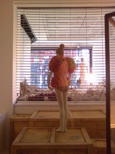
 I recently had the opportunity to assist curator of dress Judith Clark with the installation of the Washed Up exhibition at the Selfridges department store in London. From a curatorial perspective, it was like playing in the dressing-up box.
Washed Up is Clark’s response to the current “retail activism” taking place at Selfridges, to raise awareness of dwindling fish stocks and the plight of the World’s seas. Events are taking place for the next month to highlight the impact we are having.
Clark aims to use dress as the vehicle to highlight the influence nature, specifically the seas, has on fashion and the way we dress.
I got to dress a mannequin with an 1870s bustle-back dress (that would have been worn for a trip to the sea), to wrestle with a crinoline with a steel frame from the 1850s (that probably would have blown away if you had worn it near the sea’s winds), and a 1920s swimming suit in wool jersey (wet wool. Nice.).
I dressed an Alexander McQueen gown from the Plato’s Atlantis collection (S/S 2010). It was a real mix of eras and themes, and great fun to work on.
But, like most department stores, installation had to take place out of hours; hence, we installed from 11.30pm Monday night to 7.30am Tuesday morn.
I was well and truly washed up by then.
BDW
Another of my recent holiday exhibition highlights, but for very different reasons.
Dior Illustrated: René Gruau and the Line of Beauty at Somerset House on the Strand was a titillating exploration of fashion illustration at its best. And it’s all there in Gruau’s original drawings, covering decades of fashion advertising and charting some of the great social movements of the 20th century. Sex, allure, jutting hip bones, bright white teeth, vermilion lips, emancipation, audacity, an Haute Couture lifestyle. A lifestyle completely out of the reach of most women and men, but one that was easily claimed, if only for a moment, with a whiff of Diorissimo or Eau Sauvage.
What is most interesting is the amount of bleed proof white correcting fluid Gruau used to create The Line of Beauty. Even a great illustrator relied on an artist’s little helper to get the line just so.
Nothing is perfect, I guess.
BDW
 Holidays are great things. You have the time to go and see all those exhibitions you’ve had to put off due to families, studies or work. I spent a recent holiday making the most of it, hot-footing it around London’s museums and galleries.
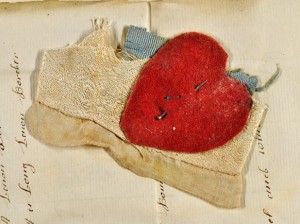
The Foundling Museum’s Threads of Feeling was a reflection on the tokens mothers left with their children when they delivered them to the Foundling Hospital orphanage during the 18th century. A memorable object was pinned to the inventory notes for each child. This was a form of identity for when mothers came to reclaim their children, and was necessary as the Hospital removed any trace of the child’s history once registered – even their names were changed.
Threads of Feeling explored the textiles-based tokens left behind in vast inventories. Embroidered poems urge a child never to give up on their mother returning. Swatches of plain navy wool remind us that, in the 18th century, most children’s clothing was made from the material of their parents’ cast-offs. Vivid ribbons and chintzes, colours still fresh after more than 200 years safely kept from harmful UV rays, are an ironic burst of brightness in an otherwise sad tale. Another irony: this is one of the best resources of 18th Century fabric in the world.
These fabric pieces are a gentle reminder that clothing in the 18th century wasn’t all about the finest silks and embroidery that money could buy, however beautiful the gowns displayed in museums are. The swatches are proof of the harsh reality of everyday living for millions of people who couldn’t afford new clothes, let alone the opportunity to keep their babies. These are the few material artefacts we have that stand testament to the reality of life for the majority of 18th century society.
Sadly, less than 1% of the children were ever collected by their mothers. It was a profoundly moving exhibition, using small scraps of material to tell huge stories.
(Image courtesy of the Foundling Museum, London)
BDW
Those are the spaces that make the difference between a blunt intrusion and a beautiful slice with a subtle knife. The spaces that underscore the intention of the creation, be it object or word, allowing a personal interpretation to take place. They emphasise and delineate the article while allowing space to pause, to feel and interpret the energy that brought forth the creation. It is where inuition lives, it is the part of the world behind the eyes, deep in the soul, in the space between bodies, minds and objects, in the interconnected energies of the universe. Those spaces speak louder than the object, louder than any words. Those spaces are the creation’s body language, the language that cannot deceive.
MBW

Recently finished reading the newly-published autobiography by Yohji Yamamoto, the great Japanese designer. It’s called My Dear Bomb. In it, he talks of the Japanese concept of ma, or the ‘empty gaps in time and space.’
Ma is all about space; it is a pause in a spoken phrase or movement, an interval between two things. It is described as a concept of the recognition of space that the viewer/reader experiences within. In other words, it is an experiential thing – the viewer’s perception has a lot to do with it.
It got me thinking about space within creativity. When we create our garments, objects, stories, whatever, do we consider the spaces in between? How do the pauses and the spaces impact (if they do at all) on our design and the story we are telling?
Any thoughts, anyone?
BDW
 A few years ago I had the pleasure to assist on a photoshoot where the model was the wonderful Carmen dell’Orefice. Turning 80 this year, she is one of the grand dames of the fashion industry, but she wears the mantle lightly.